

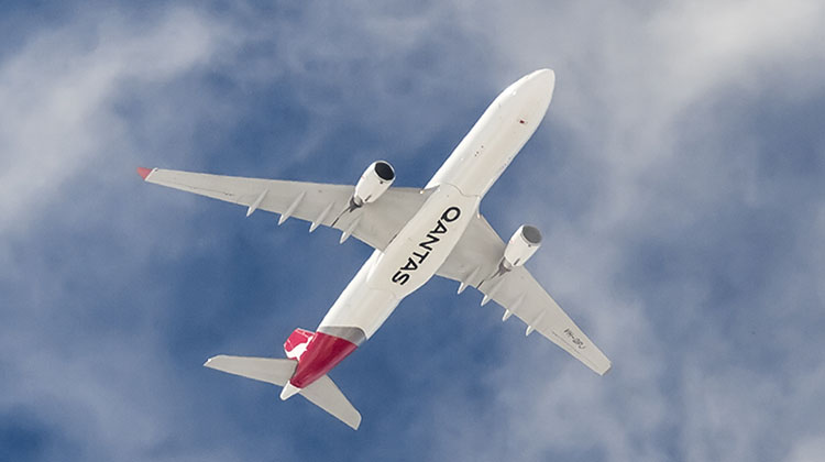
Qantas has unveiled an updated livery and kangaroo logo to coincide with plans to introduce the Boeing 787 into service late next year.
The airline says the new livery is only the fifth to be introduced since the kangaroo first appeared on Qantas aircraft in 1944, and the first livery refresh since 2007 ahead of the Airbus A380’s introduction into service the following year.
“A fresh brand helps symbolise the new era Qantas is entering as we head towards our centenary. It’s an era of new destinations, new technology and a new standard of service,” Qantas CEO Alan Joyce said in a statement on Thursday.
The new design was overseen by industrial designer Marc Newson in partnership with Australian design agency Houston Group.
“This new brand is more streamlined and the shading behind the kangaroo gives a better sense of movement and depth. A silver band now extends from the tail to the rear of the fuselage, to give a more premium feel,” Newson said in a statement.
“The typography for the word Qantas, which measures almost two metres high on the 787, has been carefully streamlined. And Qantas will appear on the aircraft’s belly, so you can tell when it’s the national carrier flying overhead.”
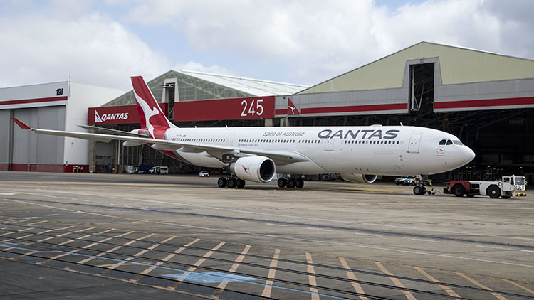
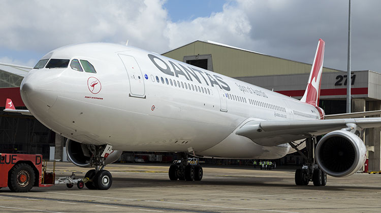
The first aircraft to be repainted in the new livery, A330-300 VH-QPJ, was unveiled to media and guests at Qantas’s Jet Base at Sydney Airport on Thursday morning, where the airline also unveiled first details of its 787-9 cabin configuration.
The new design will gradually appear across the Qantas network from today, starting with digital assets, signage and advertising, the airline said.

“Updating branding on aircraft will be sequenced with scheduled re-paints, to be completed in time for the airline’s centenary in 2020.”
NEW QANTAS BRAND SUMMARY
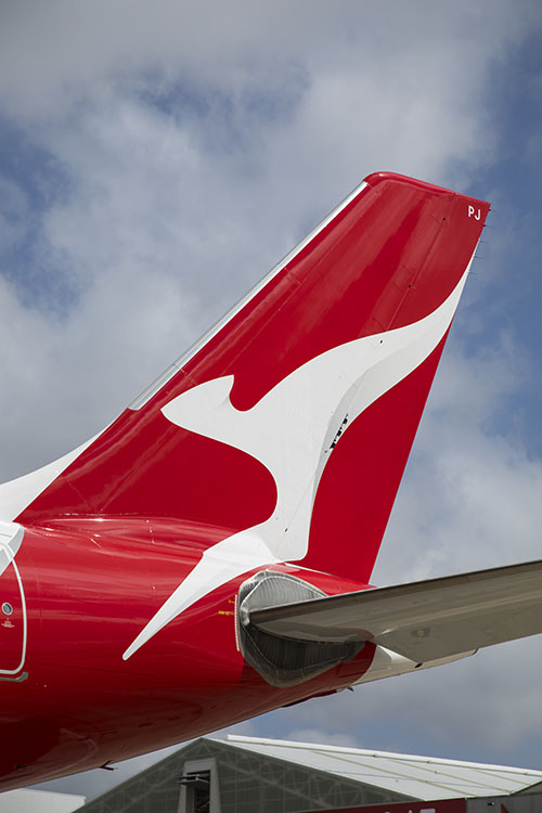
- A streamlined kangaroo on the tail of the aircraft, with shading to give it a sense of depth and movement. The kangaroo itself has been simplified for a cleaner, more modern look.
- A silver band has been added to the rear of the aircraft, flowing from the tail through to the rear of the fuselage for a more premium feel and more contrast between the red tail and the rest of the aircraft.
- A new, slimmer font for the world ‘Qantas’ on the side of the aircraft and the colour made slightly lighter.
- The word Qantas is added to the belly for increased visibility when aircraft are flying overhead.
- Adding the kangaroo to the inside curved edge of the wingtips so that they are visible in-flight and meaning they will also appear in pictures people take out the aircraft windows.
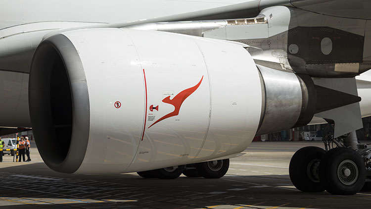
- Replacing, centring and enlarging the kangaroo that appears on outboard engine cowls, so that it is more prominent and identifiable.
- Re-introducing the iconic ‘winged kangaroo’ that featured on Qantas tails in the 1960s, ’70s, and ’80s by placing it under the cockpit window and integrating it with the aircraft name currently in this position (note: the actual aircraft names are unchanged).
The classic ‘Qantas red’ and white of the fuselage are unchanged.
Source: Qantas
Qantas has published this video of VH-QPJ being repainted:
A #newroo for VH-QPJ to symbolise the New Era as we head towards our centenary. pic.twitter.com/QfwmhSMlSK
— Qantas (@Qantas) October 27, 2016
And it has released this video to promote the new livery:


Jason
says:Will it take them 10+ years to repaint the fleet like it has since the last refresh? I’m sure I’ve seen a couple of 737s and an A333 in the old scheme recently…
andrew
says:I think the kangaroo has been stylised too far, barely recognisable now
Craigy
says:The article says that it will be done in time for the airline’s centenary birthday.
I like the changes.
George
says:How does red and white associate with Australia? It doesn’t!
This scheme still wreaks of late 80’s, early 90’s!
anonymous
says:Hate the thing that is supposed to be a Roo. Looks line nothing. Not even close to looking like a roo. Looks absolutely horrible. Not a fan of the font change either, but at least you can still tell what it says.
Tim
says:Once again AJ wastes money fixing something that wasn’t broken. Adding the name to the belly makes some sense but the rest seems to be unnecessary.
Anish
says:The red maybe symbolises – the australia’s outback – the ayers rock etc.
The design looks amazing. And yap there are old liveries around for special flights etc.
I personally like the changes. Its more streamlined now.
PTC
says:Ordinary looking revision of livery – they can rehash it as many times as they like but it doesn’t do anything for me.The base livery has been around since the 767-200’s were delivered in 1985.Time for a complete makeover to something completely different with perhaps a length of fuselage livery and cheatline – not blandness.
Christopher Campbell
says:fantastic design Qantas, great work
Rocket
says:Tony Lunn designed the biggest re-fresh of time in 1984, with the dropping of the wings and developing the triangular motif that was perfectly in sympathy with the shape of aircraft tails. It was balanced, dignified and iconic. Hans Hulsbosch ruined it 8 years ago by mangling the kangaroo and putting everything out of balance – Tony Lunn commented at the time that it was the essence of ‘inelegant design’ as he and his team had spent months trying to get the balance right while maintaining the basic shape of the old kangaroo (minus wings). This is even worse. The typeface pays zero tribute to Qantas typefaces over the years, the kangaroo is far too stylized and that childish ‘tail shaped’ logo with an anemic ‘QANTAS’ underneath it looks ridiculous – none of the grace and style of the 1984 logotype where the negative space around the kangaroo was equal on all three plains, the tip of the tail, the foot and the nose all touched at the mid-point of the triangle and the word QANTAS was precisely half the height of the triangle and the same height as the highest point of the kangaroo. Marc Newson is a good designer but he should stick to pyjamas and aircraft interiors. Sorry, but I have design background and this will date very, very quickly. It’s not unique anymore, just like any other company design. If Pan Am were still going do you think they would have rubbished their blue globe like this??? Has KLM dropped it’s light and dark blue and crown logo??? The best I can say about this is it’s not the Hulsbosch monstrosity and at least they won’t be taking credit for Tony Lunn’s design.
B707338C
says:Is this the first time an airline has changed it’s livery approximately 10 years after its last change but still hadn’t applied to the previous livery to all the aircraft. There are still aircraft flying with the gold (now rather faded) band where there is now a silver band. At least those aircraft can be considered in a ‘retro scheme’.
Virgin were able to repaint their entire fleet in a much shorter space of time.
What happened to the kangaroos front paws?
stephen,s
says:Lost ALL of the aircrafts character, really disappointed in this QANTAS. why not release a livery that actually looks like a kangaroo. The titles on the side look like an attempt to copy Virgin Australia aswell, bring back the character that defined Qantas rather than this modern art garbage.
sc
says:The font looks absolutely terrible, it looks like one you could use from microsoft word. I dom’t mind the tail as much but it is too much of a change. Why on Earth would they make the 789 their flagship aircraft? Thats a poor choice in jy opinion. Very disappointed with the rebrand
random
says:Just seems a shame that the kangaroo paws are gone and an opportunity to return to the winged kangaroo has been overlooked.
Lindsay Bordas
says:Not happy in general except for the winged roo under the cockpit windows.
Aruna
says:Maybe I am the minority but to me it still looks like a kangaroo and I actually like the updated design
Craigy
says:Can’t please everyone but I like it.. Nice touches from the past with the nose logo.
Virgin changed their livery quickly because they were rebranding from the LCC Virgin Blue to the more up market Virgin Australia. Qantas is still Qantas and the plan was to repaint the aircraft as they went through major maintenance which required a repaint..
Craigy
says:It appears that the second B789 will be ready to be delivered on 1 Dec 2017
Bernii
says:it is beautiful .. the roo has lost her paws but still looks amazing! The font is lovely too
JR
says:I like it a lot.
C’mon people, it still looks like a kangaroo! Get your glasses out.
Looks a lot more contemporary, and the font is a winner too.
Great work.
Luke
says:The writing looks like a bad microsoft word font
Frequent flyer
says:The flying Kangaroo’s had its paws amputated!
And from the looks of the economy interiors of the 787 they’ll be cramming them in.
David Fix
says:I love it including the name on the belly of the aircraft I think it is the best livery out there Well done Alan Joyce.
QFMark
says:Font change seems very unneccessary. The style of the current one is both modern and timeless to me. And yes, the new kanaga looking more like a swish than a kanga. If I’m to make one positive point, at least they’re still using the Spirit of Australia line and haven’t messed that bit up too!!
Bob Rogers
says:Great idea having QANTAS on the underside of fuselage and winglets,while design is great.
dtrain
says:I’m not a fan of the font choice – the ‘Qantas’ looks to provide movement but the lock up with the ‘Spirit of Australia’ being in a very vertical, condensed sans font seems odd. The kangaroo I can live with (although it is very much more in the line of an abstract now and I miss the paws). I do like the winged kangaroo under the cockpit and the use of the silver. Regardless of design, when you’ve been away overseas for a bit, it is always nice to get to the airport and see the flying kangaroo waiting to bring you home. Did Qantas need new livery – nah! – but I guess AJ must have had some cash to flash since removing proper check-in desks for domestic travel.
deano
says:Is it just me ?
If you glance quickly at the Qantas in the new font, the way it looks now I see Qatar or maybe i’m just dyslexic
James Smith
says:The new kangaroo is pretty armless. Paw thing!
Tony
says:Qantas should publish the consumer tests they conducted before choosing this new logo. Or did they only ask the CEO? My guess is that consumer reaction is overall negative to this logo. The Roo is so far from the real ones in my garden in Queensland that it is not a roo, just a squiggle of white on red. The text Qantas font is just boring, no suggestion of flight, speed or travel. Such an opportunity lost by Qantas who could have engaged their customers in this process.
Brian
says:Like the ‘new’ font but prefer the previous ‘roo’
John East Gippsland
says:Could have done a lot worse. It is always good design if a corporate livery can be boldly executed in only two colours. QANTAS’s evolution of its brand makes sense even though it still looks a bit retail.. However, these days, exterior aircraft branding is of lesser importance to all the other applications.
Dave
says:Can’t imagine how this Kangaroo will keep it’s balance without it’s arms but apparently the logo just needs to be close enough to be identified as a kangaroo, not an actual bloody kangaroo. Either it’s a Kangaroo with all body parts or it’s not a Kangaroo.
Shari Downer
says:Jerry: What’s wrong, Skip? What’s happened?
Skippy: Tchk tchk tchk.
Jerry: What is it?
Skippy: Tchk tchk tchk.
Jerry: Where did you get it?
Skippy: Tchk tchk tchk.
Jerry: It’s not Matt’s. Then why the urgency?
Skippy: Tchk tchk tchk.
Jerry: Jim?
Skippy: Tchk tchk tchk.
Jerry: It’s from Jim!
Skippy: Tchk tchk tchk…… Skippy our ex-friend…..
Jess
says:Wow! I love it! Wonder what the qantaslink livery will be like?
Amanda
says:I understand the Qantas underneath, but i really really don’t like the new roo looks like their going to get rid of it, it will just become a red tick or something.
Tom
says:I wonder if the 744s, 737s and the A330’s that just got repainted in the scheme will get repainted again? The 747 would look great in the new livery.
Mike
says:After losing his wings in the ’80s, the poor kangaroo has lost his arms!
Not as nicely balanced as the one I loved in the ’90s, doesn’t fit on the tail as well as the current one, and I’m sorry, but it doesn’t look like a kangaroo.
Josh
says:Etihad’s new livery is the best all together.
Craigy
says:@Tony, why should Qantas publish any of the testing they did. They have made a commercial decision. Maybe you could provide evidence to support your ‘guess’
@Deano, you need to go to specsavers. Your eyesight needs attention
@Josh, a middle eastern carrier with a tartan mosaic. wheres the connection there?
Jack
says:I love aircraft but the new livery could be represent Australia better.
Ian Morris
says:This is a terrible update. A woeful mismatch of fonts. A kangaroo that no longer looks like a kangaroo. They pay big money to design something this bad?
Anil Kattula
says:Doesn’t matter to most passengers what color their plane is painted. What matters in choosing an airline to fly is the price, whether the airline serves our destination, and the service on. board! Qantas is a long way behind the rest of the world in all of these areas. Bring back the old Qantas of the 70s and 80s including the winged kangaroo.
Phil
says:Are Qantas introducing a completely new livery for their centenery?? This current sceme is getting a bit tired..how many times can you restyle a roo for goodness sake.
Marc
says:Kiwis did a better job with their update.
john doutch
says:Well done QF. I love it. I havn’t seen it in the flesh yet though, so Hope it looks as good if not better when I do. For those who criticize it, it will grow on you.
Unhappy passenger
says:Instead of changing the livery that actually works. Why not put the mega money it takes to change uniforms, stationary, badging around the world and more, into improving the comfort for economy passengers. The food and service is appalling on the long haul flights and I have done many.
Even the cleanliness of the planes is not as good as it should be and the entertainment systems on some flights certainly needs upgrading. QANTAS put the money into the passenger experience. Have you forgotten who pays for the marketing?
The new kangaroo is unrecognisable as a kangaroo.
Rocket
says:After seeing everyone else’s hatred for this, I’ll just add to my original post as well… having given this some thought.
The real strength of the 1984 version was that no matter what it was applied to it looked like it was designed just for that application… that’s good design.
The stupid tail shaped thing on the website and presumably that will be applied to stationery, etc. makes the typeface look like it’s backhand, not italic or upright. It also, because the tail shape extends beyond the Q in Qantas makes the whole thing as applied on their Facebook example, look as though it’s falling over backward… no suggestion of forward movement at all, the font is just NOT Qantas… even if we could live with the rest of it. It looks like an amateur tried to draw the current livery in photoshop but couldn’t quite find the right font so just used the one they’ve used. What was wrong with the triangle motif… it is already suggested in the new Cabin Crew and Ground uniforms so what, they have a uniform now that suggests cues, like the Q Catering logo that no longer apply to the brand. If the typeface is this light and they use the same logic with the Qantas link logo, is it actually going to be possible to see the ‘link’ part. There are better designers out there, Landor, Pentagram. This is just amateurish.
Henry
says:I thought it was QATAR when I first saw the new livery because the font is just too similar… bad idea!
Furthermore, why would you make the kangaroo loose its paws?!?! ???
Conclusion: A TOTAL DISASTER ???
Tony
says:@craigy
Think my comment was misunderstood by you re the testing done by Qantas re the logo. It’s not commercial in confidence after the event and my guess is this work was just NOT done. In marketing, one of the major expenses is the testing with focus groups. For example, what did the Asian focus group think about having “spirit” referenced on the aircraft? Asia is a growth market for Qantas and spirits can be very sensitive. Red is usually a good colour. At what height does the Qantas logo under the airframe become illegible compared to the more visible red tail on a white body? My guess was that Qantas commissioned the work and just discussed it internally.
Jess
says:@josh@craigy it represents the deserts and the golden Sun!
Allan
says:travelled from london to sydney this year on business and they should have invested the money in their food choices. Neil perry food was awful. i do not like the new logo it looks like a child drew it. what a waste of money. Juice will go down as that guy who made qantas logo awful.
Geoff
says:A move too far, resulting in a once proud and recognised brand being wrecked.
Why can they not learn from the best like Singapore Airlines? SQ have a consistent and quality product in every respect.
Leave the current livery alone and put effort into the cabin!!!!
MJ
says:#bringbackthepaws !!
aMANDA
says:If you’re not familiar with the brand, this logo is no longer a kangaroo. It’s just a vague swirl. Since by definition, Qantas is trying to sell to foreign markets as an airline, that’s a major fail.
Narasimha
says:The kangaroo doesn’t look like kangaroo anymore. It’s front legs are missing in the logo. The previous logos were much better than the new one. Even the new QANTAS font is not impressive.
Spencer G Jones
says:Change for changes sake – Such a shame that the world renowned QANTAS tail logo has been changed – Don’t like it, All of our adult family (9 in all) have made negative comments about the change.
Martyn
says:Bring back the paws i look for the Kangaroo i dont know too many that would tell you the sqiggle is a kangaroo
Wally the Wombat
says:If it ain’t broke don’t fix it!
In the picture above of the evolution of the logo, the 3rd one from the bottom is by far the best logo IMO.
Julian deCouter
says:Oh good heavens, what a lash up. Nippers doing some fingerpainting could have done better.
There was nothing wrong with the Logo.
You guys seriously need to look at cabin comfort across the classes, improve the food and beverage operation significantly. Otherwise you may as we’ll ask PAX to bring their own pies and bottles for long hauls.
Singapore, Emirates, Qatar leave you in the hangar folks.
Best have another bloody good rethink and get a hurry on, in time for the 787-9s or you’ll still have a reputation of flying cattle transport.
It’s a bloody long way and a horrendous amount of hours in the air to do Perth to London in a single hop and you’ll have some very stroppy customers when they arrive tired out and aching from around 18 hours in a back breaker seat and given a crook nosebag to fill up on.
At 6’3″ even your business class leaves me feeling like I’ve spent the night on a wooden park bench.
Big changes needed all round and trim the prices to match the market.
Ray E
says:Looking forward to the ‘V-Jet’ livery for Retro Roo III. Hopefully QANTAS will get that done soon. Maybe on a 747 instead of a 737 like the past two.
Christine Thompson
says:Leave current exterior alone – put some imagination into the cabins. They have been long overdue a major overall. Recently flew from LHR to SYD premium economy in A380. Seats were the most uncomfortable I’ve been in in years domestic or international.
Ben
says:Thumbs up to #bringbackthepaws – The new roo looks hideous and the new typeface leaves me cold – It needs to be stylised somehow. I actually think if they’re going to change it they need to go for a wholesale colour scheme change. I seriously think they went down the wrong road by going to an all-white fuselage back in 1984. Since then I’ve always thought that Qantas aircraft have looked really boring. Qantas has sometimes offset the colour blue with the red tail in its marketing. How’s this for an idea for a new livery: Predominately blue fuselage (i.e. a nice pleasant shade of light blue all over the fuselage, where it is currently white.) Then have the Qantas typeface in white, instead of it’s current black – To offset it nicely against the blue fuselage. Then leave the tail and the roo alone (red tail, white roo – with paws) Now that livery would be refreshing, modern and interesting to look at. It would look great on any aircraft and still preserve the heritage of one of the world’s most iconic airlines. While Qantas are about it, they need to ditch the white pilot caps and get rid of the pink on the flight attendants uniforms – the pink colours just look out of place.
Jessta
says:Should have spent the money on doing something about those awful cabin crew uniforms. They look terrible and are no reflection on anything Australia at all. As for the scribble on the tail, what Kangaroo has no paws? Now the outside matches the inside – awful!
Neil Bolton
says:Love it. A beautiful refresh. And unlike some, I believe Qantas does a wonderful job. I wonder if some of these critics have actually flown much, and whether they have flown with the airlines they discuss.
Ross
says:Are Qantas changing their logo in readiness for a take over? Maybe from an international carrier who wish to be able to easily re brand.
Bantum
says:https://www.facebook.com/Bring.the.Roo.Back/
R.Wilson
says:Really this is what they call a change?! i flew business class to LA earlier this year and it was pathetic, the cabin of the A380 was tired, scuff marks all over the ‘pods’ the seats/beds were hard and uncomfortable and little room for taller people to stretch out, sleep was impossible, perhaps instead of making tiny changes to your livery which require the whole aircraft to be repainted you could put the money into your actual product!
Skippy's mate
says:I think Skippy would be ashamed to be portrayed like a cartoon character. No arms no real ears just a swirly pattern. Sorry Skip soon you’ll be a white squiggle called by some foreign name.
Geoff
says:R. Wilson is right. Forget fiddling with the “known” livery detail and go back to basics as clearly these are bereft in this equation.
Remember, it is a people business, meaning “service”. Ignore this at your peril Mr Joyce. Take note.
Tim Canning
says:I agree with so many here. They have Ruined the Roo.
First by taking the wings of it and now the paws – what’s next?
Economy passengers will be squeezed into 9 across seating. QF are saying the economy seat has more room. Believe it’s about an inch more pitch but narrower seat with 9 across squeezed into 787 Dreamliner making it a “Nightmare liner” especially on PER/LHR route. The Dreamliner was not made for 9 across but 8 in economy.
More here https://blogs.crikey.com.au/planetalking/2016/10/27/qantas-has-some-tight-news-for-full-sized-australians-in-its-787s/
I gave up on QANTAS years ago after AJ grounded the fleet.
I will stay with quality airlines like – SQ and VA
Sad as QANTAS use to be one of the world’s best airlines. Shadow of its former self these days.
C robson
says:What’s that white thing on the tail.
I hope you did’nt pay for it.
Collns
says:As usual they would rather spend a shed load on this tripe and the quite awful new tech uniforms than actually fix or even recognise the real problems. Food [for god”s sake bin Perry I wouldn’t get a burger from his place] cabin service attitude especially in cattle class and quite how the fares charged can be justified when compared to other offerings is a constant source of disgust
Grant
says:One very sick roo. Don’t mess with something that has worked for QF forever, also put the wings back. Give poor red some character and let him fly as before.
Whats with the type face!!!!!!!
Daniel
says:Each of these comments bar 1 echo the same sentiment AJ does not take seriously Qantas what it was and what it could stand for PRIDE
The new livery so so a kangaroo does not need to look like a bolt of lightning and food wise heard this from Qantas staff such a large spend to no avail and the A380 its a sad plane love the SA 777 great food comfortable seats and service second to none went for the GP brilliant
Vannus
says:Everybody’s got to have a whinge!
It’s called ‘Resistance to Change’ factor, in Psychology!
It still looks like a’ Roo!
Love the new font.
Brings it all into the 21st Century!
Good one, Mr Joyce!
Ron
says:Looks good until you get aft of the cockpit. In a few years some wunderkind will come up with the idea of putting wings on the kangaroo and he will be greeted as a messiah. Change for the sake of change.
Silver is more premium than gold?
Tropicalcat
says:Who comes up with such crap, “a sense of depth and movement” it’s something you’d expect from a 10 year old.
The last redesign was, wait for it, only 9 years ago.
You just put your head in your hands at this sort of PR speak drivel.
Dave
says:Looks smart, elegant and modern. Well done.
I like the underbelly name too
Not sure what all the whinging is about, sounds like old-school Qantas bashing. Aussies love to do that for some reason. We have a great national carrier all things considered. Sure its been through a tough few years but its definitely on the way up.
Jimmy
says:What are all these people sooking about?? Coming from a graphic design background, I LOVE the rebrand. The red gradient gives it a subtle depth and the font is a lot easier to look at. Also the roo is growing on me (you’d be stupid to say it doesn’t look like a roo). It’s nice and refreshing.
Cabin-wise, however, there are several things I can agree on that need to change and improve. First, the food is fairly mediocre. The food needs to taste more fresh and genuine, and the menu needs to be updated. Second, the space between rows is a little too confined for my liking. Perhaps adding at least 30 cm of leg room will suffice. Also the seats need to lose firmness and feel more ergonomic and soft, to an extent. Lastly, the IFE needs to be improved as follows: Brand new full HD touchscreens with a faster response time. Better audio quality and an extra 3.5mm jack socket for own headphones alongside the standard L and R sockets. Also diversify as well as add more IFE choices with regards to movies, TV, music etc.
Overall, still my airline of choice.
blackandwhite
says:100 different people 100 different opinions. I like it, the new “q” looks cleaner than the kangaroo looks more modern. Change always stirs up people who are afraid of change.
Taurean Lea
says:That has got to be the best chapter in the history of Australian Aviation, because this brand new QF logo looks more modern and much more futuristic than the 2007 brand!!! We now have lots of generations of QANTAS kangaroos and I think this would look great if lots of QF aircraft could wear older Retro liveries, take the 1984 livery with The Australian Airline titles for example, or we could give one 737-800 the 1961 livery, which John Travolta’s 707 still wears!!! 😀
angelo calleja
says:Why not just do with the Roo, and have a big red tail. the QANTAS font change is good, and again the underside logo is good for visibility.
Sandy
says:The new pilots’ hats are simply appalling! Pilots now look like baggage porters from some 3rd world country. Who approved those? And the non-streamlined script on the fuselage looks silly. Overall, we now look like a hillbilly airline. Definitely not an improvement.
Well, after 40 years of being a loyal Qantas passenger, I gave up flying our national airline when they started flying through Dubai; there are much better ways to get to Europe, IMHO.
Ian Deans
says:Could have brought back the old Australian Airlines roo…..at least it looked like one.
Richard
says:I’ve got to agree with the vast majority here. Putting aside what the planes look like on the outside (whoever heard of a kangaroo without paws), at the end of the day it’s what’s inside that matters.
In July, I flew cattle class in Emirates, JAL and Qantas to Europe, Japan and back to Oz. The Qantas flight back to Oz on an old tired 747 with looped movies, abysmal food, a (I use this definition loosely) “seat” that set new levels of discomfort and indifferent crew was such a contrast to the other carriers.
It’s not hard to compare products between airlines. Qantas would have to know they are not on the same par as the Singapores, Emirates, JALs etc but there appears to be little effort going on to refresh and improve the whole flight experience. That’s what really matters.
I don’t think the negative comments about the new livery are Qantas bashing as others have suggested. I think everyone wants Qantas to succeed. It appears to be more frustration that Qantas management have once again failed to address the basic problems that have been long standing and unresolved. A pawless kangaroo and a different font does not solve the problems.
Gary
says:So many critics!
The joys of being a “national carrier” where people think they actually own you without having to buy shares.
This design seems like a reasonable evolution to me.
Get over it folks.
Bruuno
says:I’m a shareholder so I think I’m entitled to pass comment on the design Gary. Overall, not a bad effort but the loss of the paws on the kangaroo is a loss of identity and defeats the purpose of having it in the first place. It’s not far from a shapeless swirl and for people who don’t know that it’s a roo on the back they’ll be hard pressed to realise it is.
And the new caps, Not great but if they had some decent badging they might get away with it, Not something an 8 year old could whip up with a texta and a sewing machine.
With Todd Sampson on the Board I expected better. It all looks a little too done by some ‘dynamic’ Gen Y’s and everyone lapped up the presentation when it was pitched.
Natasha
says:Agree with comments above – this is frustration with management of a company that is succeeding in spite of truly woeful performance. It’s when people stop commenting that the problem will be too late to solve.
Steven
says:Take away the vintage kangaroo on the nose, and the red one from the engine nacelle
(see the Boeing 787 drawing for example of how much cleaner an all white engine looks)
and it could work, I think they work against the more modern image the livery is aiming at.
Mark Johnston
says:Just a minor observation but i thought Id throw it into the mix
Some commentators are saying that this is Alan Joyce’s way of stamping his influence over the airline with
this new branding ….the same way that Geoff Dixon did in 2007 when the last rebrand was done
Back then, the aircraft that was rolled out in the new livery was Boeing 767 VH-OGD (Note the GD in the rego which conveniently spells out Geoff Dixon)
Fast forward to 2016 and the aircraft used is an Airbus A330 VH-QPJ (now i know its not AJ but maybe Paddy Joyce is close enough :)))
Ben
says:Wow what a massive comment response. It just goes to show how much passionate opinion a change to the national carrier can elicit. As per my previous comment here and my other comments on this site – I’m not a fan of Qantas and certainly not a fan of the new design. For others here that describe it as resistance to change etc. I would only say that change for the sake of change is not a good idea. I’m all for change but a pawless roo is a step too far. Methinks the problem may lie with Mr Newson. I don’t doubt he is a great designer but he did the A380 interior and that is hardly spectacular. His latest effort here, like I said, leaves me cold. They need to get someone who appreciates the heritage and is able to modernise with a new colourful livery that will capture the imagination. Think of it, the new roo is little more than a stylised letter T. Surely the national carrier can do better than that. My current dislike of Qantas is something that I wish could change. I wish it was a national airline I could be proud of and my carrier of choice. However unfortunately not at the moment. This latest update is not a good move and I think serious change is required. Yes Qantas may be back in profit, but I wonder how long for if they keep going in their current direction.
Grumpy
says:Flying Kangaroo? Really? They’re kidding me right? Oh … they’re not … they actually convinced themselves that this IS a Kangaroo and the public would believe them…. beam me up Scotty. Please. Before I die of laughter.
Brenda
says:Disappointing that you can’t recognise what’s supposed to be on the tail of the plane, look at Air NZ and when one of there silver fern beauties comes into land.
Do like the underbelly. Laugh at people’s comments about the food, as in I agree, being a vegan I had no chance of getting anything being edible on a flight from BNE to LA. They had a great opportunity to come up with a range of ideas and then smashed it on social media to see what people voted for. They say profits are down but what did they spend to get that done which probably won’t last.
Bob
says:The ‘Flying Kangaroo’? What kangaroo? I also wonder at the cost of this change in logo design. A shame the money was not put into passenger comfort and services.
Rocket
says:@ Tony.
The whole exercise as with much to do with modern management is laced with BS… note the use of words like ‘space’ to describe what was previously a ‘place’ or ‘department’ or ‘sector’, going-forward and the equally ungrammatical ‘going forwards’ – the point you make about ‘Spirit’ I’ll just give you some history.
When the clown with the bow tie took over, he hated the fact that the Board decided to keep the name and Qantas branding… prior to him taking over, they decided to remove ‘The Spirit of Australia’ as the by-line and replace it with “The Australian Airline”, it was said at the time that it was done for a number of reasons, one was ‘spirit’ didn’t translate well in Asian markets. If that’s the case and wasn’t total BS to get the word ‘Australian’ on the aircraft somewhere to appease all those ex TN people who couldn’t handle change (and thought they were god’s gift to the airline industry even though they were almost broke and no one outside Australia had ever heard of them or their predecessor TAA) then why was it put back again less than 10 years later, then made even more prominent a few years after that??? They should have asked long-serving staff or long-loyal customers… the Sydney Swans asked their members what their alternative strip should be even down to alternative colors to red, whey couldn’t Qantas do the same.
I think it’s really bad. We’ll get used to it but I predict sometime down the track in a more enlightened era it will be quietly changed to a more traditional version again… BA’s world tails didn’t last long did they and neither will this non-Qantas branding. Either that or the company will just lose its unique image as rubbish like this erases it’s history.
ctj
says:Yes I concur with previous comments completely
The stylised Roo is unattractive……bring back the winged roo everybody loved that logo!!
Flight attendants uniforms are only marginally more attractive than those of VA…… (ugly)
And cabin service continues to deteriorate in the absence of any real competition
Dont airlines realise that what passengers remember most about a flight is cabin service and amenity?
Geoff
says:Yes, take your eye off the ball in cricket, a batsman goes out. Same in business especially the aviation business. It is a people business!
QANTAS, you have many runs to make so listen to your customers and stay in! It is a long haul game remember!
Doug Gren
says:Change for the sake of it.
Consider SIA, Thai, Lufthansa, KLM, SAS, JAL and ANZ. Their drastic livery re-designs have retained their original logos in (at least to my eye) near-identical form. I’m old enough to remember the winged ‘roo, and I don’t think it would look too out of place even today. The current iteration is a dumbed down, blurry, vague abomination. I suspect that for some that aren’t familiar with the animal, it’s not immediately obvious what it depicts.
Oh wait – it did make it easier for VH-OEJ to trace the outline before its final trans-Pacific flight!
Neil
says:What was wrong with the last Livery? What a waste of Money!!!!
Tinai
says:Mr Shateholder Bruuno “I’m a shareholder”. It’s pax like you that make us ?.
Sell your shares and take your pretentious attitude elsewhere.
God almighty -let me tell you the basics. Shareholder , CEO ? -you know nothing about the heart of this airline.
You are all want to be’s.
We don’t like you. We don’t need you.
Ask the workers.
By the way, FQ flyers make us ? too.
Most of the time you aren’t paying for your own tickets and honestly your names have to be read off the ordinary little list they give us to try to remember the names of completely forgettable people.
Bring back the wings. Mind you-Qantas hardly flew anywhere-even before COVID
John Menadue you need to come back.
Marum
says:A Kangaroo is the animal that is synonymous with Australia as well as the Koala. As we are Australians we know who QANTAS is and recognise the logo as a highly stylised Kangaroo. Would someone in Austria , Russia, Africa, recognise it as one? That is probably why they had to write QANTAS on the underside.
Don’t fly upside down over major cities boys, or no one will know who you are. Actually. If you were upside down, they might just guess.
No! The new logo is one advertising dept Graphic artist too far. QANTAS management; You’ve lost it chasps.
Regards….Marum.
Michael O'Brien
says:Sack the advertising agency. Qantas spent millions promoting the flying Kangaroo. So what did they do? Clipped the wings off the logo. That’s got to be dumb and stupid.
Rocket
says:@ Doug Gren
I have a design background and please, give me a break… SQ??? Singapore Airlines’ logo may be well known but the livery on their aircraft would have to be the MOST BORING and outdated piece of rubbish in the industry, cheat lines went out decades ago and SQ have persisted with a wholly unimaginative livery which is the most DESPERATELY in need of an update… adding a gold strip and toning down a yellow line every now and then does not improve this pathetic livery.
I’m no huge fan of the new QF livery but Singapore Airlines… OMG, it’s dead boring.
Rocket
says:@ Marum.
Having travelled all over the world I can tell you that even school kids in Thailand recognise Qantas… the same as you could go to the Siberia and mention Australia to a street musician and they would start playing Waltzing Matilda. The nation nor the airline are as unknown as you think.
Jane Duxberry
says:You should change advertising agencies or maybe you should ask members first as it will cost a lot less. The new logo is a waste of money as it not as easily recognised as the old one – why change something that works and if you think it needs updating then make sure the kangaroo shape is easily recognisable.
Marum
says:@ROCKET. Agreed mate. I’ve been around a bit too, and I am fully aware of the “Waltzing Matilda and Kangaru” connection with ‘Straylia. But that does not mean they would recognise that logo other than a red squiggle. The main question I am asked, (overseas) by they who have a fair grasp of English, is why QANTAS does not have a “U” in it. Thus I have to explain the origins of the airline, with Hudson Fysch, and so on.
My people came from the central west of Qld. So I heard a lot of the old stories first hand, my dad did one of the early joy-flights with either Fysh or McMaster – in Barcaldine, I think. Dad had a lot of memorabilia of the early days of QANTAS , and donated it to the museum at Longreach before he died. BTW. IFR = I Fly Rivers. Which Hudson Fysch did a couple of times when he got lost, and thus found the town he was looking for. Navigation must have been difficult in those days, before the navigational aids and radios we have now. Also, they often landed in a paddock, or on dirt road, and asked directions.
Regards……Marum.